A Revolutionary Road to Get Around.
Hey you all. I would first like to thank all of you who have visited this website and looked at the ideas I have posted. I am deeply honored that many of you too have considered these ideas worthwhile and would like to see them implemented.
Well, here comes a good one I think. As I was talking to some people on the KDE IRC channel yesterday, there was a comment made about a possible way to orient new KDE users on how to use the desktop. However, I believe that users should be left clues to discover their desktop on their own. There should not be an intro popup or anything like that. Ponder about this for a moment.
What can you say, for example, about paintings. Paintings are not "explained" to anyone. You look at it and you get it in your own particular way. That is enough for you and you know what it means. The clues left by the artist are clear enough to your mind that you find meaning in the painting. You intuitively "know" what the purpose of the painting is. Reflect for a moment on this Cezanne and know what it means.
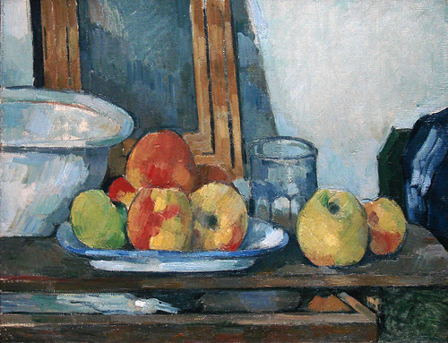
Beautiful. I love this painting.
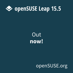
Anyway, for KDE this idea is not very clear, I think, neither is it for the folks at OpenSUSE. Here is what they do:

You see that huge pop up in the middle of the desktop? I sure do, and if anything, it does not feel like it's there to teach me what the desktop does. Not for novice people either. Just think of the message at the bottom about the "build service" provided by OpenSUSE (which is excellent). That is certainly not geared to me. Moreover, there is a link within it where you can find an "introduction to KDE" which ends up being an internet link. How does this, if I may ask, teach anyone how to use the buttons and bars located behind this huge pop up?
It reminds me of this

And my behavior toward pop up windows has not changed since I started using the Internet. I close the pop up. I do not want it there. I believe this is a behavior shared by many, given the fact that novice users are Internet users primarily. The Internet is easier to use than many apps in their computers.
Here is the Revolution Idea that I thought of. I have seen things like these before and they have worked great for me. Simply add a notification upon first start. Give 2 simple instructions and then let the user discover.

Two simple instructions that can lead to great discovery. No Internet links, no desktop blockers, just empowering instructions. These notifications can go away after clicking each of them, I guess, and they could come back if there was a link on the desktop or something of the sort.
I know what you're thinking, the notification on top does not describe the menu that is showing there. Don't worry, I know that. It's just that I love the BeOS like menu up there. But the plasma widget selector is a good one too.
Tell me what you think. Let's make this idea grow. And in case you are wondering where all these ideas are coming from, here is the book that inspires me the most.
http://www.amazon.com/Presentation-Zen-Simple-Design-Delivery/dp/0321525655/ref=sr_1_1?ie=UTF8&s=books&qid=1279437212&sr=1-1
Don't feel like you have to get the book, you'd better check out his blog. Garr is an amazing presenter and designer.
presentationzen.com
Well, here comes a good one I think. As I was talking to some people on the KDE IRC channel yesterday, there was a comment made about a possible way to orient new KDE users on how to use the desktop. However, I believe that users should be left clues to discover their desktop on their own. There should not be an intro popup or anything like that. Ponder about this for a moment.
What can you say, for example, about paintings. Paintings are not "explained" to anyone. You look at it and you get it in your own particular way. That is enough for you and you know what it means. The clues left by the artist are clear enough to your mind that you find meaning in the painting. You intuitively "know" what the purpose of the painting is. Reflect for a moment on this Cezanne and know what it means.
Beautiful. I love this painting.
Anyway, for KDE this idea is not very clear, I think, neither is it for the folks at OpenSUSE. Here is what they do:

You see that huge pop up in the middle of the desktop? I sure do, and if anything, it does not feel like it's there to teach me what the desktop does. Not for novice people either. Just think of the message at the bottom about the "build service" provided by OpenSUSE (which is excellent). That is certainly not geared to me. Moreover, there is a link within it where you can find an "introduction to KDE" which ends up being an internet link. How does this, if I may ask, teach anyone how to use the buttons and bars located behind this huge pop up?
It reminds me of this

And my behavior toward pop up windows has not changed since I started using the Internet. I close the pop up. I do not want it there. I believe this is a behavior shared by many, given the fact that novice users are Internet users primarily. The Internet is easier to use than many apps in their computers.
Here is the Revolution Idea that I thought of. I have seen things like these before and they have worked great for me. Simply add a notification upon first start. Give 2 simple instructions and then let the user discover.

Two simple instructions that can lead to great discovery. No Internet links, no desktop blockers, just empowering instructions. These notifications can go away after clicking each of them, I guess, and they could come back if there was a link on the desktop or something of the sort.
I know what you're thinking, the notification on top does not describe the menu that is showing there. Don't worry, I know that. It's just that I love the BeOS like menu up there. But the plasma widget selector is a good one too.
Tell me what you think. Let's make this idea grow. And in case you are wondering where all these ideas are coming from, here is the book that inspires me the most.
http://www.amazon.com/Presentation-Zen-Simple-Design-Delivery/dp/0321525655/ref=sr_1_1?ie=UTF8&s=books&qid=1279437212&sr=1-1
Don't feel like you have to get the book, you'd better check out his blog. Garr is an amazing presenter and designer.
presentationzen.com


8 comments:
Post a Comment