Keyboard Uprising: Typing on the Desktop to Launch Applications

I am a big fan of Gnome-Do. I love the simplicity with which they handle program launching. I do know that there are other methods and applications very similar to what Gnome-Do does, like Krunner and Launchy. There have been many ideas going around about what is best to use when launching applications and I think that the options currently available are good and they do the job. However, can these launcher programs be pushed a little further? I believe that the current keystroke methods used right now are good and fast. Can they be simpler? More intuitive?

This question has hunted me for quite some time. I do believe that keystrokes for launching programs is faster than working with the mouse. But I also do not use more than that. I just launch applications. I understand that many of these launcher apps actually do more than that, such as mathematical calculations and things like that. But this is something that escapes my simple mind so I just do that by hand.

Let's just take 2 of these launcher programs and talk about the way they launch the applications you need. Gnome Do, for example is launched by pressing the Window button plus the space bar (This can be different though) after which a small glossy field appears in the middle of the screen. Then the user is supposed to type his desired application and gnome do will fill in the rest.


After some time, Gnome-Do keeps track of your most used applications and it fills in the rest of the name by understanding your habits. For example, I know just type the letter F and Gnome-Do suggests launching Firefox. That is what I do the most when I type the letter F, so Gnome-Do does the rest.

Another launcher that is very powerful is Krunner. If you want a more comprehensive list of functions for Krunner, go to this link

http://userbase.kde.org/Plasma/Krunner


It works in a very similar fashion to what Gnome-Do does and I believe it was conceived a long time before Gnome-Do. This time, Krunner is launched by doing Alt+F2. Although this combination is good and Krunner is a very strong launcher, I do not like extending my fingers that much to launch a program. You may think that I am the laziest person in the world (maybe you are right) but I think that such keystroke makes you loose balance when typing. The same thing goes for Gnome-Do. Keystrokes are sometimes confusing, and you seem to spend more time finding the right key combinations to launch the launcher, more than you take launching the application that you want. Which is the intent of the launcher in the first place.

Here is the idea. Would it not be cool if users were simply able to start typing anywhere in the screen, the name of an application and Krunner or any other launcher program would pop up immediately to launch the program? To me this seems simpler than doing keystrokes to get launchers going. It could even be used to pop Kickoff open and automatically search through its menus.
I like this idea, but there are a few problems with it too. Originally, I thought that it would be good to have users click on the desktop, an empty area, and start typing. Currently, when you type after clicking the desktop area, you could select icons that have the letters you look for (I may be wrong about this one). Whereas, in other window managers, there is no effect. Typing on the desktop is something that has no use.

So, there is a "market" so to say, for laucher programs to go the extra mile. A desktop that you can type in. Just start typing and the apps you want will pop right away. Although, I think it could also be confusing for new users to see this message box show up out of nowhere and you don't know what to do. I guess some little information about this feature should be made available.

Another potential problem is fullscreen windows. Under KDE, full screen windows will cover the whole screen (hence the name, haha) not leaving any areas on the desktop that can be visible. The fullscreen window extends everywhere covering the top edge of the KDE menu as well. But this could be solved by not allowing windows reach a complete full screen. Much like MacOSX used to do it.


The Good Things
Again, I think tha the best thing about this idea is that it is faster than Launcher programs and would focus users more on what they want rather than the way to get there. A more practical approach. No keystrokes but just the ones you want. You would still be using your launcher application of choice, like Krunner.

What do you all think>?

4 comments:

Planing for a Revolution

Working on design for the openSUSE project is indeed a hard thing to do. I am not a Novell or openSUSE employee. I do what I do with my free time, which will be drastically reduced soon, because the school year is starting at the end of the month. I am hoping to keep posting as often as I am currently doing it and finding those things that are little, and can be changed for a better openSUSE.
Because I will have less time to work on this, I need to focus my energy and think more practically. I need to make something happen and work it out.

This is the reason why I got in touch with Jos Portvliet from openSUSE. We have been talking recently about how to make some of my ideas become a reality. His input is pretty valuable to me. It is, I think, the first time someone from all the way up there in openSUSE has shown willingness to work through some of these ideas. Jos thinks that the Revolution ideas are good but they need to be focused; and I agree.

We came up with a plan to have some things changed. But here I am officially looking out for help from designers that work on the openSUSE project. Sorry about this, but I am looking for people who are designers, highly critical of openSUSE's current layout design as well as their theming. Why? because the all-inclusive nature of Linux communities appeals to a great variety of people. All of them can give us an opinion, very valid too, but not all the time specific. A lot of times, all we get is rant, disagreement, but no solutions. Right now, with this project I am looking for people who know about development and design because the openSUSE/KDE desktop also needs creative solutions.

So here is a rundown of a simple idea expressed in plan form:

Objective.

To make openSUSE a Linux distribution more friendly to novice users and adopters by creating a customized graphical user interface based on KDE but with different graphical elements than any other Linux distribution. This will make openSUSE visualy recognizable and branded to a higher level than it currently is.

Analysis

Form a designers team. We will:
  • Revise openSUSE graphical stance.
  • Point out design improvement areas.
  • Create Strategy for New Look.
  • Propose strategy to openSUSE community.

Design Decisions
  • Work on reduction, simplicity, automatization and layout design.
  • Gather the most relevant design complaints from designers team.
  • Work on the top 3 design changes for the next release of openSUSE.
  • Gather programmers and propose new design ideas.
  • Implement other 7 suggestions for upcoming releases.

What we will do:
  • New KDE plasma style and arrangement (plasma style, desktop widgets, wallpapers, etc)
  • Kickoff's redesign
What do you think? Who wants to join me? If you are serious about this, please send me an email and we will figure out how we will work together and make these things happen.

This plan is not perfect and if you have great input to share on it, please do. Let's be a team. We can do it.

PS: Please, do not even think that is idea is in some way, a tool to take over the world. I am not working independently of the opensuse-artwork team. All we would do is gather material to work on it for the future. No forks, no new teams. Just a community effort. The opensuse guys work really hard on the graphics and they do a great job. What we are doing is a revision and proposal of ideas, nothing more.


9 comments:

The Yast Revolt of 2010: Ideas to Improve Yast Software Installations

Yast has been for a very long time the front face of openSUSE and SUSE, for that matter. It has been redesigned a few times and it has matured as one, if not the only one, best control center for the Linux Desktop. In many ways, having a graphical environment that allows you to configure otherwise hard tasks, is always welcomed. Yast is one of the strongest attraction points of openSUSE and it has suffered considerable criticism over the years as well. For once, it was criticized because it was a graphical environment that "dumbed down" things. Others did not like the layout, categories, etc. You name it and I bet that Yast has received these bad mouthing.

Although I love Yast and its graphical incarnation, I am yet to see innovations in the areas of simplicity and also with being current. Here are some transformations.

I am always very happy that SUSE has tried to make Yast very simple and powerful. I got to use most of the ones that I show here. But I will focus mostly on the installation section of Yast. Why? Because, I believe that new users coming to SUSE have to learn how to install software on SUSE. We know that Linux has a few package installation methods that can be hard to describe or make available to novice users using SUSE for the first time and wanting to get programs installed.

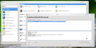
The current method seems to be a little too long and rather complicated. Starting with finding the Yast Install and Remove icon. These are the steps.

You see here that the longest way to find the application installer from Yast is about 5 clicks away from you. Some may say, "well, you can find it if you search for it on Kickoff." Others say "You can go to Computer and you will find it." While these two assertions are correct. I think that novice users do not even know how kickoff works, neither can they guess that the icon they are looking for is in the "Computer" tab. I believe, most users will first go to the Internet to find their applications. They'll discover that they do not work on Linux if they come from Windows or Mac. It would be hard for them to realize that their installations are done through a special Yast module.
For this reason SUSE created 1-click installs. Users go online to the openSUSE website, search for a package and then install it with 1-click install. I love this feature, it is much simpler than Ubuntu's Internet based installations. Following some tutorials, I generally end up adding repositories to the deb package system, then installing the program. SUSE solves those extra steps with 1-click install.

Once users reach the desired installation module within Yast, another interesting thing happens. It is an avalanche of information.


First of all, Yast opens two more windows to do the installation. The Yast module which contains all the categories is one, then the installation window, and finally the installation feedback window. 3 Windows until you see what is going on. It doesn't stop there. If you notice at the last window on the screenshot, you will see a few things going on. First (I was installing Dropbox, by the way, and ended up installing 400 MB of information, crazy) you see a window divided in 4 parts. The first two give you a number of packages to be installed and where they are coming from, the second one gives you feedback on the particular package that is being installed at the moment, third comes the progress bar for the individual package installed at the moment and finally there is a progress bar that shows the overall installation progress. That was a lot to type for something that can be done simpler. Do you think that novice users will want to see this? I think, pragmatism is a quality that characterizes novice users. They want the job done, simply and fast, and honestly, I do too. I hardly ever pay attention to all this feedback on this window.

Another idea that has flooded the market recently is related to cell phones. Once Apple created the iPhone and the iPod, they created an online store that would give you applications for these devices. iTunes for example, opens and connects to the online store on the spot, to make you see some apps that you might want. After they did this, many other companies have dome similar things. Websites featuring small and practical applications for a variety of  devices, music players, tv, phones, etc. The online interface provides a very stylish ad customized way to present users with options that they might want.

Thinking about this and also the 1-Click installation system done by openSUSE. I believe that SUSE created an online app store without realizing it. SUSE Has the technology already, they just need to tweak Yast, the installation module, to be like this. In my spare time I thought of something extremely simple to use that, I think, can be done without much pain.

Here are the mockups. These are not perfect, but they can get to be with your suggestions.


Tell me what you think.


4 comments:

Highlights of a Revolution

Valuable design principles like symmetry, consistency, and simplicity are all part of the idea I am about to share with you. I will be talking about highlighting and selection graphics on the SUSE/KDE desktop. Why? Because this is a subject that not many have talked about and when it comes to designing this aspect of the GUI, many just follow what the precedent has done. I am not here, however, to tear down anyone's effort to make these graphics, but rather, give a personal explanation and solution based on the three design principles aforementioned.

I believe that as SUSE embraces a different idea about highlighting and selecting, they can leave a palpable trace in the world of GUIs. Yet another aspect that can make SUSE "highlight" itself as a very unique Linux distribution and a viable solution for anyone's computing needs. The KDE desktop does not seem to have a clear idea of what they want to do with selections, they rather take ideas from everywhere and put them on the desktop. There is lack of consistency and direction. It is time for a revolution.

But first things first. An analysis of the current design ideas on different desktops. Here are some examples from Windows, Mac and SUSE on the way they currently handle highlights and selections.

Although this is an extra settings, Windows can add a check mark box beside an item. At the same time, this image shows how there is a selection, and a hovered item. Selections have a darker tone of the same color family, in this case, blue.


This one comes from the redesigned windows panel and this image shows two different colors. The blue is the current hover/selection and the orange one is a different kind of selection, probably a new item or one that needs attention.


Mac OSX also has a few ideas on highlighting. I have to say that Windows and Mac have a lot in common when it comes to consistency about their highlights and selections. They have a very consistent coloring and color identification for the items used. But it seems to me that OSX has a reduced amount to highlight and selection options. A more concise concept.

I am sorry that I could not find a better example of this, but here is one. Icons in OSX on the desktop only get highlighted on the tittle name. Sometimes these icons have descriptions, like the one above, in which case anything other than the file name do not receive the highlighting.

In this piture, there is a multiple selection going on. The selection is pretty much the same in all the OS's that I have used. When you choose multiple items, with the mouse pointer, a rectangle appears which selects everything that it covers. In OSX you see 3 elements of selection/highlight: The selecting rectangle created by the mouse pointer, then the OSX file name highlighting, and finally the application icon highlight, a gray square over the selected icon and about the file name. Additionally, and this is present in Windows as well, there is a place selection on the right location menu.

openSUSE also follows a few ideas conceptualized by Windows and Mac OSX. Probably because Linux is an OS brought about after Windows and Macs had already set foot. This is not an accusation, by the way. From the 3 OS's in question, it seems that openSUSE has the most selection/highlight ideas on the desktop. Here are some, there could be more but I can't think of any other.

  
This is Dolphin's idea for last selection, an underline. Dolphin also features hovering just like Windows, a lighter shade of the selection color. In this case it is light blue.

The the next one is panel button highlighting. This is very similar to the latest Windows 7 panel highlighting. A glow or light that shows on hover for the selected icon.

Here is a window highlight for the current window present on the desktop. A blue band that tells you that you have this one window selected (personally, I do not like this because it is an extra visual idea that is already set forth by the sole presence of the window in the front of other windows. It must be because I am working with this window).

This is probably the one I like the least. A frame going around the hovered item. The frame does not change into a solid color as it happens in the folder selections within Dolphin.
The selection on the Folder View Widget, I think, is one of the most elegant of all the present on openSUSE. It is simple, very non-distracting, it does not divide selections with different colors like multiple selection does in OSX for example.
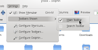
Menu items hovering in Dolphin, and just any other KDE 4 application, shows a fade out near the right end of the hovered item. This time, the selection coloring takes after the color set forth by the window. This is, I think, very consistent. It shows users in a simple way that they are working with something foreign to icons. The selection is done inside the menu and does not take the coloring from side to side like OSX does with its menus. KDE's does not touch the menu edges, neither does it touch menu item separators. Additionally, KDE's menus underline the first letter of each item on the menu. If you press the underlined letter, then you select such item.


I really don't like these two very much. On hover, you see the light blue but at the same time a popup image shows you the items contained inside that category. The highlight is good, but the popup gets to be annoying after a while. Can you see how it hides the rest of the System Settings items?

This one has to do with buttons and drop down menus. The button features a blue frame for hover and selection and the drop down menu item keeps that blue on it as it is hovered.

And here is the one created by the Plasma team. A similar idea to other items on KDE. Selections and hovering do not touch menu edges, it take over the whole area around the selected item.

The ideas that go around different OS's and the way the represent highlighted and selected items differs greatly. Not to say that this is a problem. I believe it is rather a strength. OS's dare to be different and they seem to be more interesting to work with. Simplicity is something that I value, I believe that openSUSE does not have this simplicity yet. The KDE desktop features a few ideas that can be used across the whole platform. I am not saying either that OSX and Windows treat this better.

A more centralized highlighting system should be in order to make sure that applications, menus and icons respond similarly to hovering, highlighting and selecting. Fewer options that mean selection would be better, in my opinion. The varied array that the SUSE/KDE desktop shows seems inconsistent. It comes across with the point but it could be reduced.
Next is the problem of selections and the number of selections made. Single items are the only ones that receive hovering, whereas multiple items do not receive any hovering, you can only select them. Then what is hovering for? Selection of multiple items is also done through key combinations such as using Control for multiple individual items and Shift to select all items within a range. However, I do find that I select more individual items than a range of items. I spend most of my time selecting with Ctrl key rather than Shift and if I need a range of items then I selected with the mouse pointer or simply do Ctrl + A to select everything. Then, if I want to take items out of the selection range I press Ctrl and click on the few that I do not need to work with.

Finally, there is the concept of symmetry. Symetry gives the impression of order, good organization and tidiness. But Dolphin File Manager got this symmetry very well in the beginning, but it ended up creating this optical illusion when many icons were selected. http://www.michaelbach.de/ot/lum_herGrid/index.html#

So, KDE guys decided to change the selections a little bit and came up with this:


Perfectly fine, right? The optical illusion is gone because of the spacing. Look at what happens when the icons are smaller than tittle ans icons.
Symmetry in Dolphin is lost.

Possibilities
Here are some of my ideas about what selections could be like. Here is the revolutionary treatment for selections. These are not perfect, help me make them better. Your support is important.

Enter a selection mode. Whenever you are working with many items the file manager can show you, among other things, a "Selection Mode" where you can click on each possible selection method and work freely with your items.


Selection with helper icons upon hover. I would actually do away with highlights. let the mouse pointer have extra power and it will seem more natural to just locate the mouse. Provided that the pointer has within it the ability to alter elements underneath it. Another suggestion would be to do away with popups. Elements in the desktop can be worked a little extra and would be able to become self explanatory through the use of explanatory labels for example. Or even better, if the user seems to take less time hovering and just clicks items, make KDE realize that the user already "knows" what the icon or elements do, therefore popups can be done away with after a while. Also, avoid underlining, it really looks out of place. Again, empower the mouse pointer.
Finally, take ideas from the Plasma desktop and place them on the applications. Highlight with glows, they seem natural and can be worked to be very beautiful.

About buttons, follow daily-life examples. They can be quite elegant. For example, elevators. Here are some pics:


5 comments: